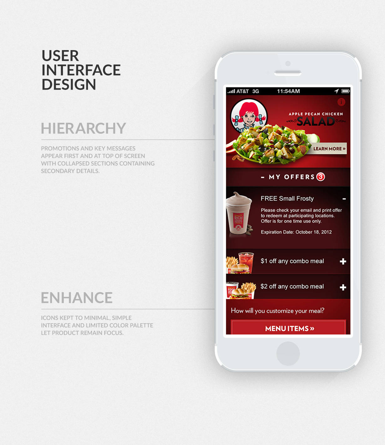
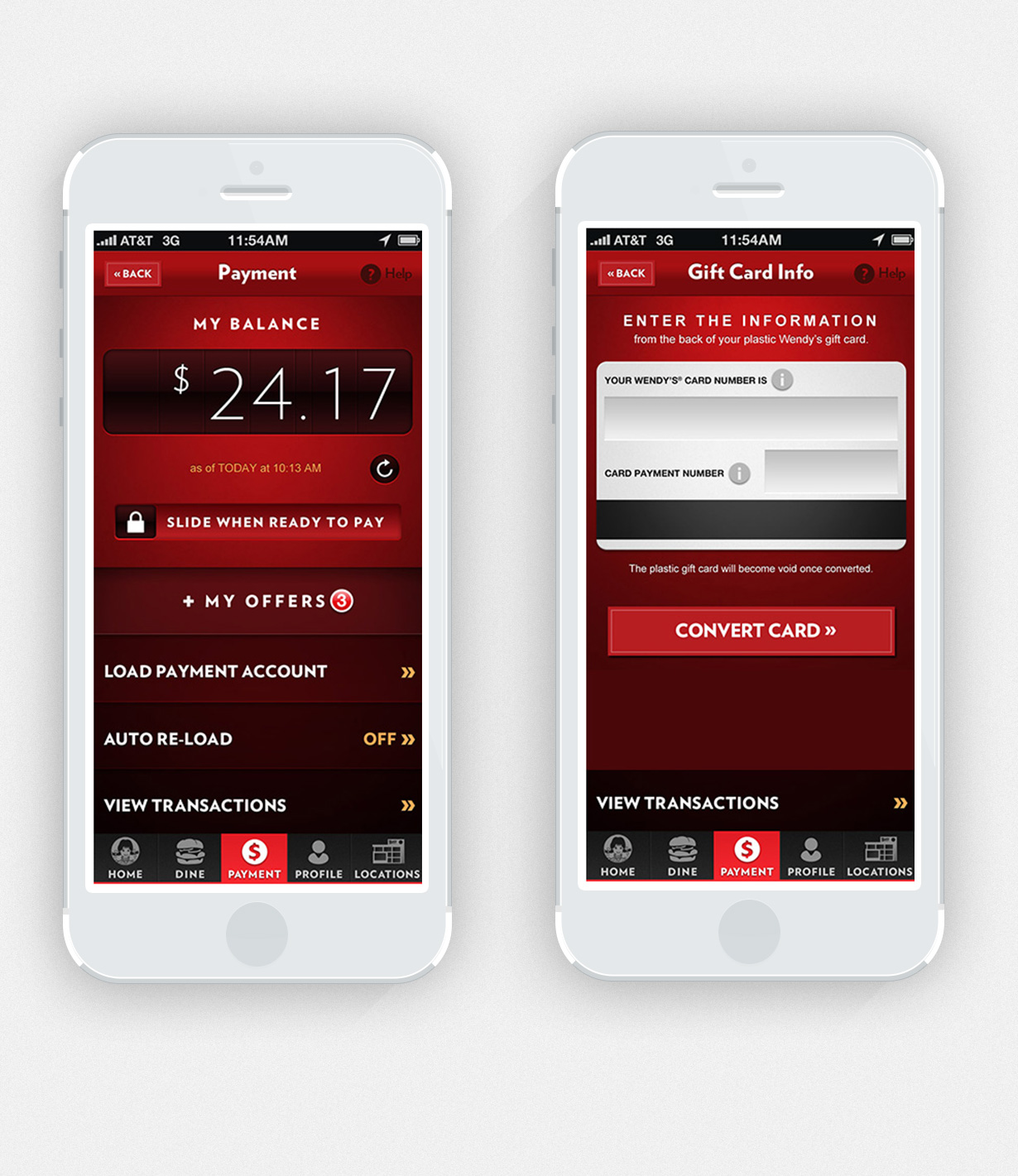
My Wendy’s
Mobile AppMy Wendy’s
DISCOVERING THE NEED
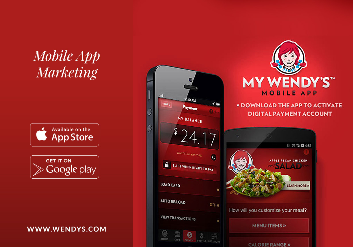
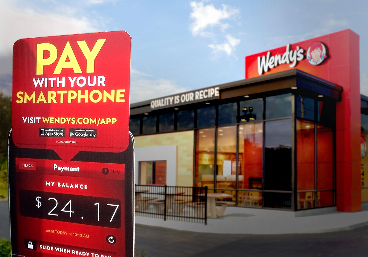
Let’s face it, brand personalization is the only way for brands to stay relevant since the invention of the smart phone. So what’s a fast-food company to do when not quite known for showing that much care for their customers? How about make the experience easier; improving speed of transaction, visibility and customization of menu items, personalized nutrition facts, suggesting closest locations, and providing deals right on the tiny screen in your hand.
WIREFRAMING A SOLUTION
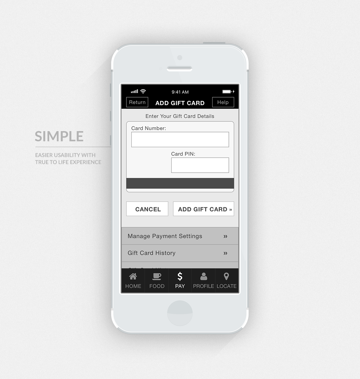
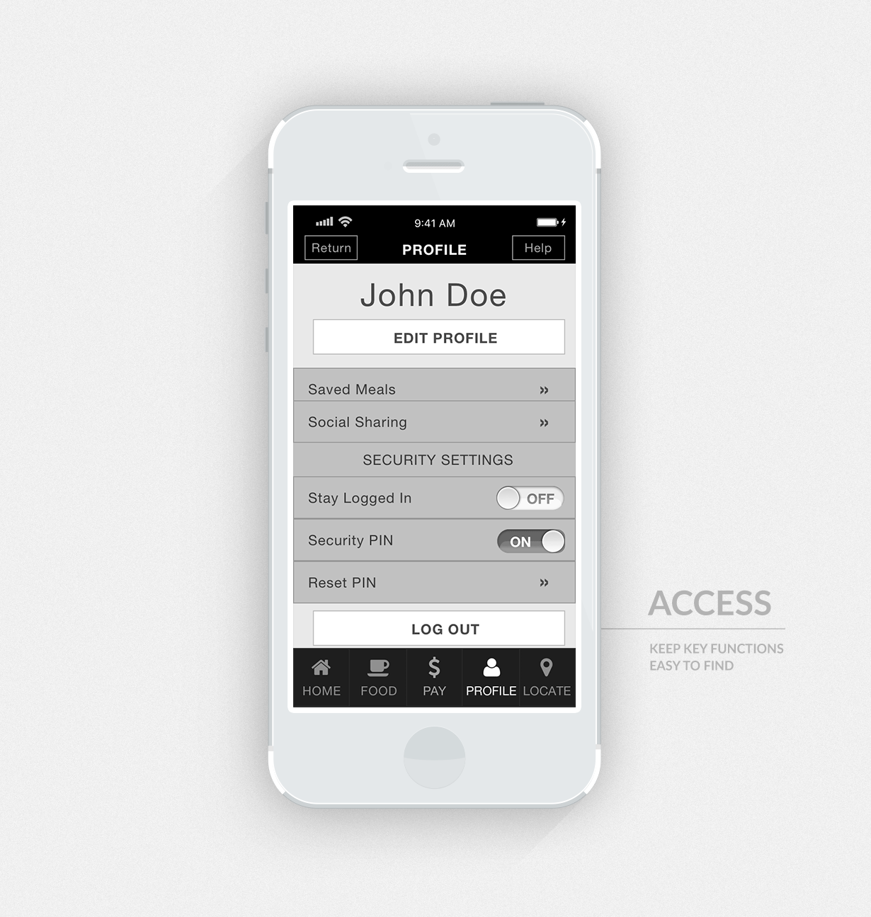
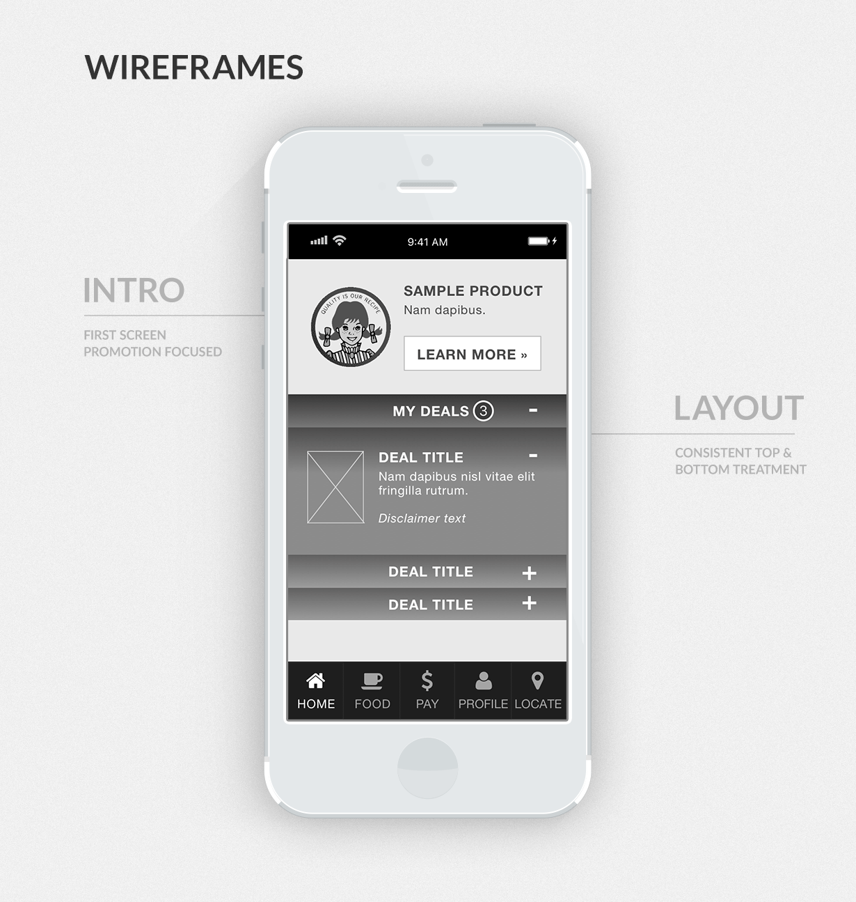
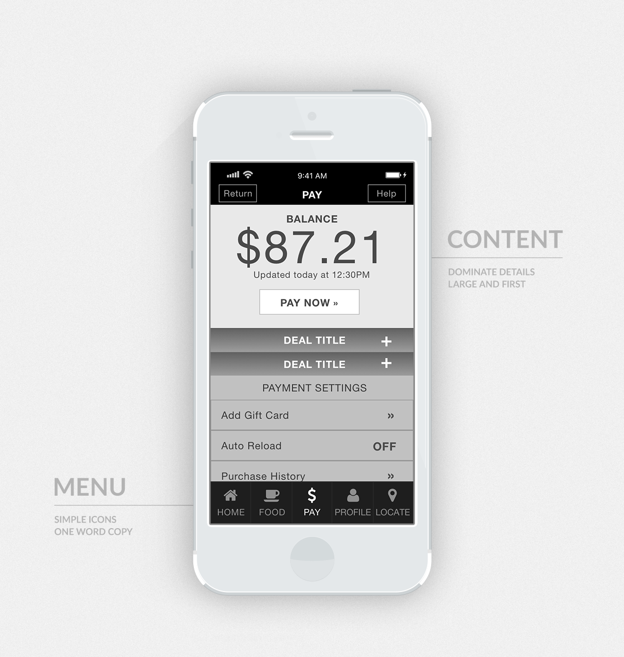
To be a traditionalist is sometimes okay; for instance, when approaching a new scenario. Mobile payment at the time of this app was almost non-existent. However, a coffee company proved that people in a hurry are still willing to exchange mobile transactions for virtual gold stars. Therefore, after establishing goals, scope, and constraints of the native mobile app, it was my responsibility to display findings from consumer and competition analysis into a logical architecture of content in low-fidelity wireframes.
