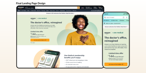
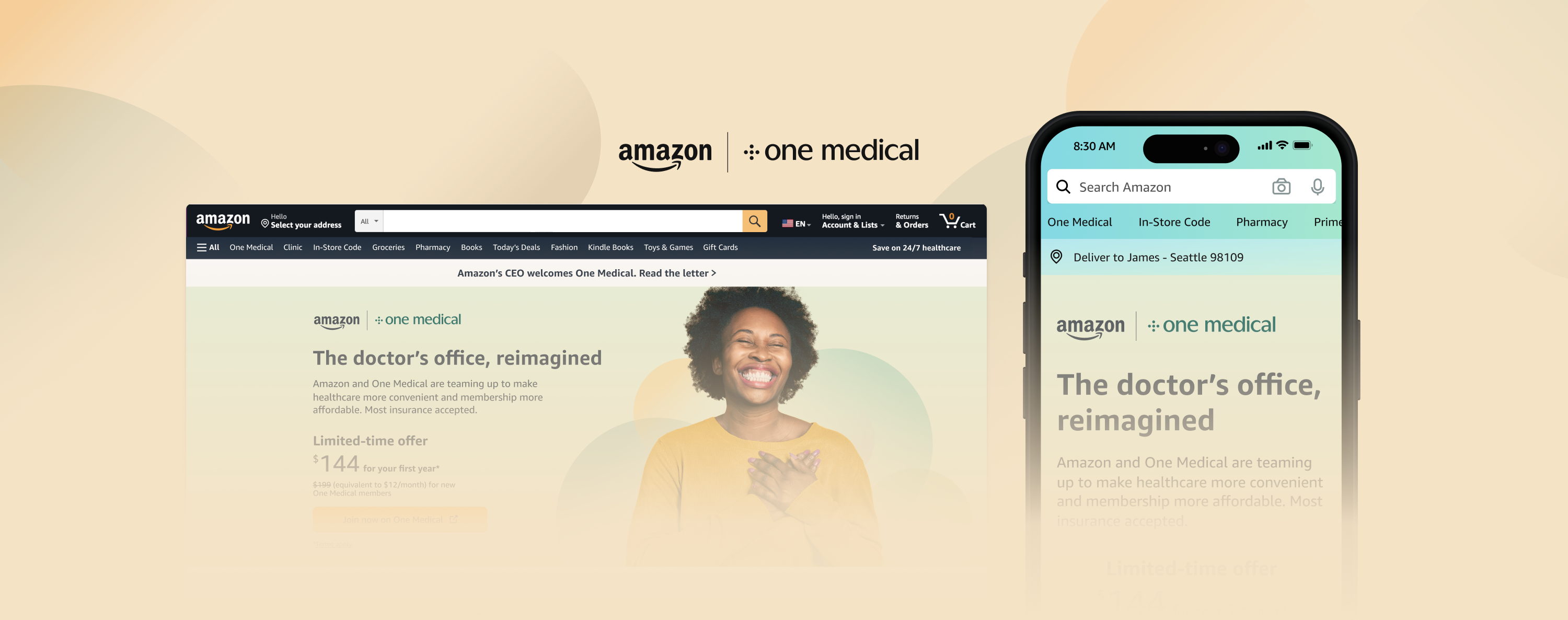
Amazon + One Medical
Sr UX DesignerAmazon + One Medical
The problem
The complex nature of the U.S. healthcare system, including the reliance on private insurance, has led to gaps in coverage and barriers to access for many individuals. Having to navigate the system for adequate, high-quality, and affordable medical services is challenging and usually occurs at the worst of times.
Timeline
November 2022 – February 2023
Role
Lead Sr. UX Designer
Amazon / Health
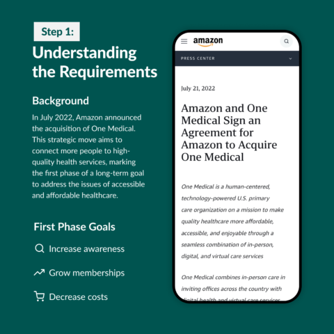
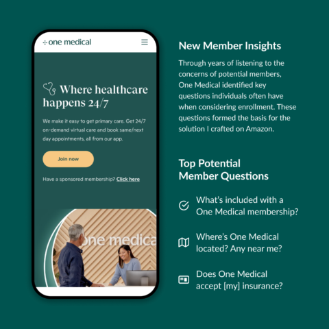
![]()
Market Research
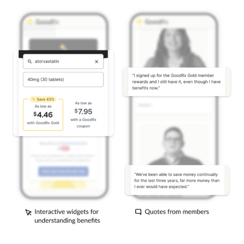
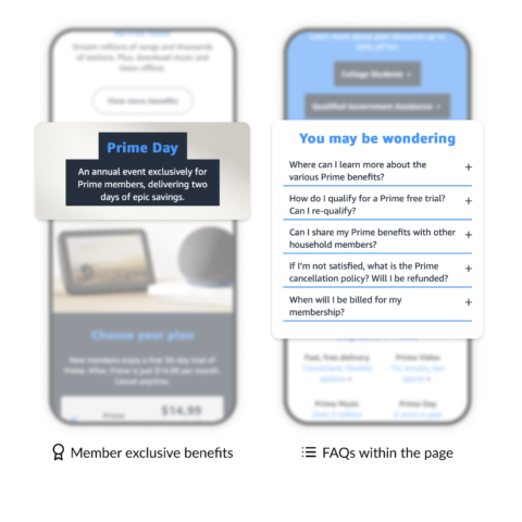
To understand the market landscape and competitive dynamics, I found similar experiences related to memberships / Amazon. Then I audited the content to discover if there were any commonalities of what information was displayed and how it was presented.
![]()
A Team Effort
To improve efficiency, incorporate diverse perspectives, and foster alignment within the group, I facilitated a team content mapping workshop of the market research. Participants included Product Managers, Software Engineers, Designers, Copywriters, and Legal stakeholders.
![]()
Designing the Experience
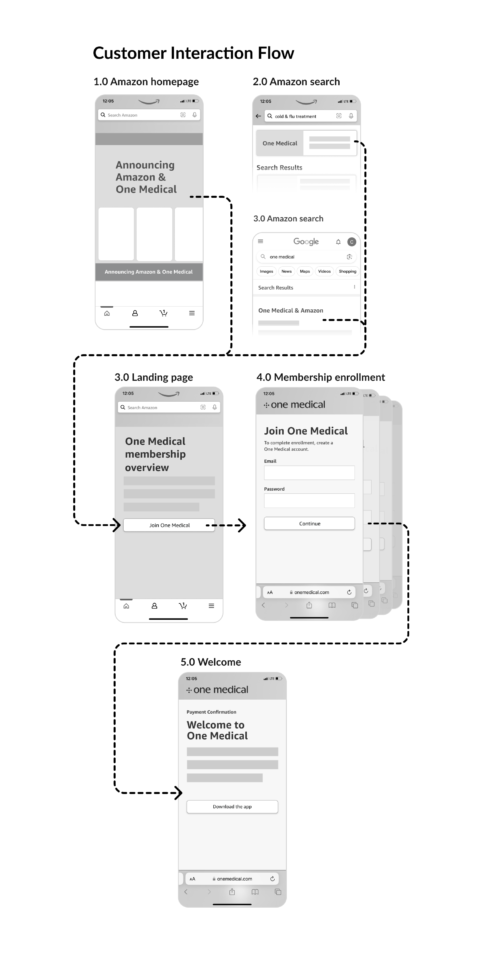
I started the process with low-fidelity wireframes for the overall user experience, aiming to understand how individuals might anticipate discovering, evaluating, and joining One Medical on Amazon. My goal was to identify natural integration points for seamlessly and frictionlessly enhancing awareness and the enrollment path.
![]()
Branding the Interface
A challenge I faced was trying to find the appropriate balance of the Amazon and One Medical brands. Collaborating with a Visual Designer and Copywriter, I explored various degrees of each brand resulting in defining a color palette, type treatment, logo lockup, and design guidelines for the experience.
Evolution of the Design / My Process
I started the process with low-fidelity wireframes for the overall user experience, aiming to understand how individuals might anticipate discovering, evaluating, and joining One Medical on Amazon. My goal was to identify natural integration points for seamlessly and frictionlessly enhancing awareness and the enrollment path.
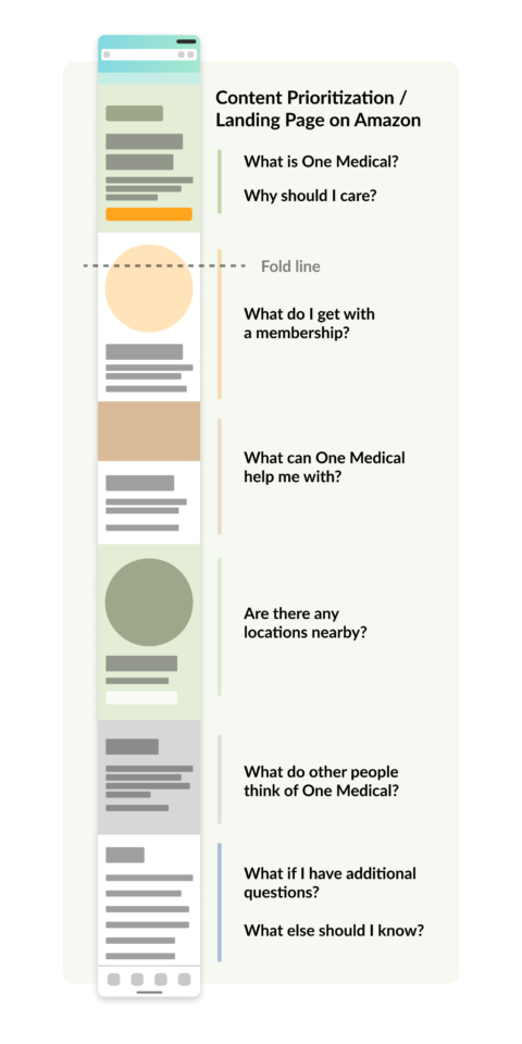
I also wanted to create the right level of awareness on Amazon of the One Medical membership. After mapping out the ‘discovery phase’ of the user flow, it became clear a landing page for these experiences to navigate to would be ideal.
Utilizing the findings from the team content mapping brainstorm and the top new membership considerations, I drafted a recommendation of the landing page content.
I shared and iterated on both the wireframe flows and landing page content map with stakeholders of the project including Project Management, Software Engineers, Design Leadership, Brand Designer, Brand Copywriter, and Legal.
